What is Light Graffiti?
Light Graffiti is long exposure photography in darkness with the use of light sources to create words, patterns or drawings.
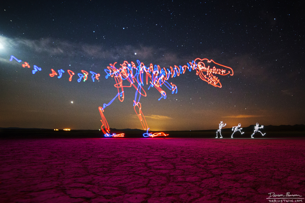
Darren Pearson
Darren Pearson who goes by the name Darius Twin is an American artist who specialises in light painting. When looking at specialist artists he really stood out from the crowd to me. His drawings are surprisingly detailed compared to other artists I came across, especially considering you can't see what you've drawn so it's easy to overlap your strokes. Another unique thing about his work his use of colour. Few artists use bright colours and so his work is unique. The background is very important to him as well. He clearly puts more effort into the location than other light artists as these shots feature some really remote places.


I wanted to try some light graffiti myself so set up my camera and tripod in my garden. I used my phone screen, phone camera light, sparklers and a torch in my experiments. I tried continuous type and separated letters. I did this by turning the torch off or covering the light source while I moved onto the next letter. I found the separated letters were often more legible as some letters don't join together well in a italic style. It was hard not to overlap where I'd already drawn and in some attempts I got my space completely confused and the light drawings clashed. Another difficulty was completing the drawing in the 30 seconds of exposure. As I was lighting the sparklers in the wind, taking the shot, and drawing the light myself it was a bit of a rush and so the sparkler ones are particularly messy as the strokes are rushed. Since then I have discovered a BULB setting where you can have the exposure last longer. You can't turn a sparkler off like a torch either so the letters are all joined and illegible. One problem I came across was that in order for the type to be the right way you have to face the camera and write backwards or have the camera behind you and write in front of you normally but try not to block the light with your body. Both of these are inconvenient so I tried facing the camera and writing in front of me like I would normally, then flipping the picture so it doesn't read backwards. I experimented with single strokes and layered sketchy strokes as well as the speed at which I wrote the stroke. I then did some random patterns to see the perspective and tried throwing the torch around inspired by kinetic photography.
Overall the technique takes some practice in order to look professional but I think the theme could be successful on an album cover as it hasn't been done before as far as my research seems. However if I were to use this technique I think the photo should be of Long Beach or have Vince Staples in it, other wise it wouldn't have any relevance. As that isn't going to happen, and illustration gives more information on who the artist is, I'm going to take that approach. I do think the light graffiti would make very unique eye catching artwork and it could even be used on the inside of the album booklet along with song lyrics etc or for album posters or merchandise. If I were designing more of the albums campaign rather than just the cover art then I would definitely try to incorporate this in part of the campaign.
Overall the technique takes some practice in order to look professional but I think the theme could be successful on an album cover as it hasn't been done before as far as my research seems. However if I were to use this technique I think the photo should be of Long Beach or have Vince Staples in it, other wise it wouldn't have any relevance. As that isn't going to happen, and illustration gives more information on who the artist is, I'm going to take that approach. I do think the light graffiti would make very unique eye catching artwork and it could even be used on the inside of the album booklet along with song lyrics etc or for album posters or merchandise. If I were designing more of the albums campaign rather than just the cover art then I would definitely try to incorporate this in part of the campaign.


No comments:
Post a Comment