Wednesday 24 June 2015

Final Album Cover


This is my final album cover design. The concept behind the artwork relates to the meaning of the album. It is named Summertime '06 as this was when his friend was murdered and so it was a turning point in his life. In the foreground you can see Vince Staples  with fans hands reaching out like he is performing. However Vince's expression is sorrowful as he looks up to the skies. This relates to looking to heaven or praying to God. Above him in the background you can see a sign for Ramona Park and a street sign for 65th street and Obispo ave. These mark where he grew up in Long Beach and near where his friend was killed. Vince mentions Ramona Park, 65th street and Obispo ave in many of his songs and can be seen posting photos of these signs below. These significant signs are placed above him where he is looking  suggesting they are always in his thoughts. Overall the cover's meaning is that despite his success and crazy life he never forgets his friends death, that point in his life, and where he came from. This adds contrast with the title as Summertime has positive connotations for most people but Vince remembers the summer of 2006 for all the wrong reasons. The back cover features the same portrait but zoomed in to show the detail. The track list luckily fits nicely around this portrait when arranged correctly. The font is very square representing the urban genre.

Vince Staples official twitter background image.

Vince Staples next to Ramona Park sign in Sprite x Fader ad.

Vince Staples image post on instagram.


Overall I am happy with the outcome of the album cover, especially the concept. However I feel with more time and experience I could execute it better. One thing I am happy with is the illustration of Vince Staples as I had already improved since my experimentations. The illustration style was inspired by Will Prince and Joxen who make sketchy/messy drawings of hip hop artists. I felt the ragged style with scribbles really matched the urban genre. I learnt from my experimentations and created a more professional illustration with a good balance of black sketchy lines and better colour toning. If I were to improve it I would add more effects and a better background so the foreground and background flow into one more seamlessly. Also I think the hands at the front and the signs at the back are too cartoon'y. I think I would improve the anthropometry so they are more human like but in the illustrated sketchy style so they match the portrait. At the moment the portrait seems to be in one style of illustration and the hands and signs in another. I like how the back cover relates to the front cover making them link. Also a lot of back covers tend to only feature text so I feel my back cover is quite unique and eye catching. The zoom and arrangement of the type fit round each other which looks very professional. Visually I think the cover is eye catching and will stand out amongst Hip Hop covers that are predominantly only black and white this year. If I put myself in the shoes of someone who doesn't know of Vince Staples, I think the cover would come across quite professional and the fact that there is a message would be quite obvious. Cover's with these traits certainly make me interested and want to give the music a listen which is what I wanted to achieve.

This project was a good learning experience for me as I gained knowledge in an area of design that I have considered specialising in and have learnt and improved my photography and illustration skills. Light graffiti and sketching then illustrating are skills I will use and improve in the future.


Tuesday 23 June 2015

Development

After I decided to take the illustration approach over light graffiti I sketched some quick ideas. The cover had to be clearly Hip Hop and eye catching in order to entice someone to want to listen. 


Front Cover
To make it clearly Hip Hop I thought of illustrations of him rapping aggressively over his mic, as seen in the top left, top middle and bottom left designs. I then looked at just a large close up image of his face, much like Will Prince's portraits, as seen in the bottom middle design. None of these ideas seemed to grab me so I thought about the album title and what I understand of it. I then thought of conceptual ideas about the contrast between summer connotations and his negative story. The top right idea was Vince Staples  in black and white as the main focus and the background was going to be blurry people in colour. The colour would show the positive side of summer, blurred to show movement. Vince Staples would be black and white to represent his negative memories and still and in focus to suggest time stopping. The sketchy Will Prince style would suggest an urban genre. The bottom right concept idea was similar, featuring Vince Staples in the centre behind a crowd of reaching fans. However he is looking up to the heavens looking sorrowful. Above him are faded images of a ramona park sign and street signs. These represent the story and where he comes from. The overall concept was despite his success and lifestyle, the summer of 06 is always on his mind. The concept ideas were my favourite as they had a message and told a story, which could intrigue a viewer. I chose to finalise the last idea as in the previous one black and white played an important role, which were colours I wanted to avoid due to competition.


Back Cover
For the back cover I looked at placement of type and the use of imagery. The top left idea just featured the tracklist centered which was a bit boring. The top middle idea featured Vince Staples  with the tracklist in a continuous paragraph above. The top right idea shows a close up of Vince bleeding off the page with the tracklist left justified filling the other half of the cover. The bottom left idea shows a ramona park sign as imagery with the tracklist in the bottom right quarter right justified. The bottom middle idea is the view of my chosen front cover but reversed. The perspective is from  behind so shows the signs fade into the back of Vince performing to a crowd. The tracklist would be overlayed and it would be unique to turn over the case and see the same image from behind. The bottom right idea was Vince's head close up but cropped in half bleeding off opposite sides. The tracklist was then centred between them. Overall I liked the use of imagery as its more visually appealing and would build a theme with the front cover and rest of album campaign. The bottom middle and top right were my favourite but I chose to design the top right because the bottom middle would likely have illegible type due to the background its on.


Chosen font 'Agency FB'
I was scrolling through fonts with an open mind and this font just stood out. I kept looking for alternatives but kept thinking they weren't as fitting as this one. I think I like it because it has a nice weight to it, light yet bold. Also it is quite condensed which I think made 'Vince Staples // Summertime '06' seem shorter. I think the squared shape of the font makes me think of urban environments like city skyline silhouettes and bricks and buildings.This combined with the sketchy ragged illustration style, hint at urban music.


I researched cover measurements and measured myself to confirm.
The front cover is 12x12cm and the back cover is 11.75x15cm


Light Graffiti

What is Light Graffiti?
Light Graffiti is long exposure photography in darkness with the use of light sources to create words, patterns or drawings. 


Darren Pearson
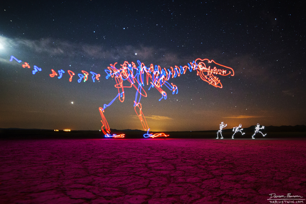
Darren Pearson who goes by the name Darius Twin is an American artist who specialises in light painting. When looking at specialist artists he really stood out from the crowd to me. His drawings are surprisingly detailed compared to other artists I came across, especially considering you can't see what you've drawn so it's easy to overlap your strokes. Another unique thing about his work his use of colour. Few artists use bright colours and so his work is unique. The background is very important to him as well. He clearly puts more effort into the location than other light artists as these shots feature some really remote places.


I wanted to try some light graffiti myself so set up my camera and tripod in my garden. I used my phone screen, phone camera light, sparklers and a torch in my experiments. I tried continuous type and separated letters. I did this by turning the torch off or covering the light source while I moved onto the next letter. I found the separated letters were often more legible as some letters don't join together well in a italic style. It was hard not to overlap where I'd already drawn and in some attempts I got my space completely confused and the light drawings clashed. Another difficulty was completing the drawing in the 30 seconds of exposure. As I was lighting the sparklers in the wind, taking the shot, and drawing the light myself it was a bit of a rush and so the sparkler ones are particularly messy as the strokes are rushed. Since then I have discovered a BULB setting where you can have the exposure last longer. You can't turn a sparkler off like a torch either so the letters are all joined and illegible. One problem I came across was that in order for the type to be the right way you have to face the camera and write backwards or have the camera behind you and write in front of you normally but try not to block the light with your body. Both of these are inconvenient so I tried facing the camera and writing in front of me like I would normally, then flipping the picture so it doesn't read backwards. I experimented with single strokes and layered sketchy strokes as well as the speed at which I wrote the stroke. I then did some random patterns to see the perspective and tried throwing the torch around inspired by kinetic photography. 

Overall the technique takes some practice in order to look professional but I think the theme could be successful on an album cover as it hasn't been done before as far as my research seems. However if I were to use this technique I think the photo should be of Long Beach or have Vince Staples in it, other wise it wouldn't have any relevance. As that isn't going to happen, and illustration gives more information on who the artist is, I'm going to take that approach. I do think the light graffiti would make very unique eye catching artwork and it could even be used on the inside of the album booklet along with song lyrics etc or for album posters or merchandise. If I were designing more of the albums campaign rather than just the cover art then I would definitely try to incorporate this in part of the campaign.


Experimentation

I carried out some experimentation inspired by Will Prince and Joxen. I loved the messy sketchy illustrated style and wanted to try it myself. I feel the ragged style matches the explicit, rebellious, and aggressive nature of Hip Hop and Vince Staples in particular. It therefore could potentially be a style I use for my cover.


For these 3 pieces I traced loosely over images on a light-box to get the rough outline. I then added some scribbles to mark shadow and made sure there was no facial detail, just like Joxen's work. I then scanned them in and layered different shades of colour in the background. I used solid fills as opposed to smoother gradients that would give a realistic look. I then finished them with a scary feature that adds an animal like edge. For example a bright overlayed eye and mouth feature. Overall I was pleased with how these turned out for first time attempts. I definitely think that with the lessons I learned from these I could make better designs that would be suitable on an album cover for someone with music like Vince's.


I also wanted to try some free hand sketching as this is one of Will Prince's stand out factors. I chose this image to copy and this was my first outcome. The shape is not perfect but some of the drawing still resembles Vince. It is definitely a skill that takes time to perfect.


I then tried a 100% CAD design. I illustrated straight over the image in illustrator using quick strokes in order to get the messy imperfect style. It definitely doesn't give the same messy effect you get with a hand drawn image as the strokes and weights aren't as natural. 


Next I tried some sketches based on Will Prince's technique before he scans in his image. Below is a rough image he drew of artist Young Thug. He began with a yellow highlighter to sketch the rough shape then added bolder black lines and orange. I tried the same style using a light box but the outcomes looked more like they had been drawn and then the scribbles added after. They didn't look natural and I think I drew too many lines whereas I should have kept it basic.

Using the light box again, I tried different materials such as soft pastels (left) and oil pastels (right). The effect wasn't as successful in my opinion because the strokes aren't as solid or dark as a marker.