
Vince Staples
Age: 21 (02/07/1993)
From: Los Angeles, California
Vince spent some of his upbringing in the Compton and Lynwood areas of LA but considers Long Beach his home. His parents wanted to move him out of Compton due to it's notorious gang culture. However, the county of Los Angeles in general is known for Black and Hispanic gangs, with Bloods, Crips and Sureños all originating there. This meant moving to the north side of the bordering City Long Beach, only 15 minutes away, he was still exposed to lots of crime, gangs, and violence. Much of his songs content are about him growing up in this environment, his Dad's gang and drug activity, and his own involvement. In this video he shows Complex around where he grew up, including his Grandma's house in Compton where he shot a video to a single in August 2014. He mentions in this interview, only 9 months later, that three of the people in that video are now in jail and another is dead.
Link to interview and article on Complex's website:

His sound could be classed as modern gangsta rap which was made famous by, and is associated with, the West Coast where he is from. Here is a song and video from his latest EP.
For more information on Vince Staples, check this interview with Complex:
http://uk.complex.com/music/2013/10/who-is-vince-staples/
Artwork

This is the cover for his first mixtape 'Shyne Coldchain vol.1'. Vince said he was just being funny when naming it this but it stuck. It is a mix of Shyne (rapper who signed to P Diddy's Bad Boy Records in 1998) and Rosco P. Coldchain (rapper affiliated with Pharell's Star Track Entertainment), both of whom were charged with murder cases. He claims to have made this project in a few weeks. This, combined with it being his first release, is evident in the artwork. Not much time, money, or effort has gone into it. It's simply an old photo of him. Rappers often feature photos of themselves as kids on their artwork, especially their first mixtape or commercial album, as it is an introduction to who they are.
...............................................................................................


This is his second mixtape, named 'Winter in Prague'. Again it is quite a simple design. The front has a plain solid fill background with the title written on it. If you look closely, the type is filled with old buildings and castles, which I can only presume are images of Prague (known for its historic buildings and nicknamed 'the City of a Hundred Spires'). The back cover features silhouettes of Vince Staples (left) and Michael Uzowuru (right) who produced the entire project. The front and back covers have a consistent turquoise/teal colour theme (suitable for winter) and overall it looks a bit more professional.
...............................................................................................

This is the cover for his third mixtape, 'Stolen Youth', with Mac Miller (under his alias Larry Fisherman) who handled all the production. The cover has a comic style, supported by the cartoon characters and narrative box in the bottom right corner. The three characters must be the Cutthroat Boyz, with Vince Staples centre, Joey Fatts to the right and Aston Matthews who is latino on the left. The imagery relates to the title, as they are in their youth as babies with balaclava's as if they are going to steel something. I think this is his best cover so far as the illustration is unique and eye catching and makes it look very professional. The comic theme was continued for all the singles released.

This artwork for the single 'Guns & Roses' has the same illustration style and font used for the name and speech bubble. This shows it is clearly related to the mixtape. The imagery relates to the words again, with guns and roses featured in the image.
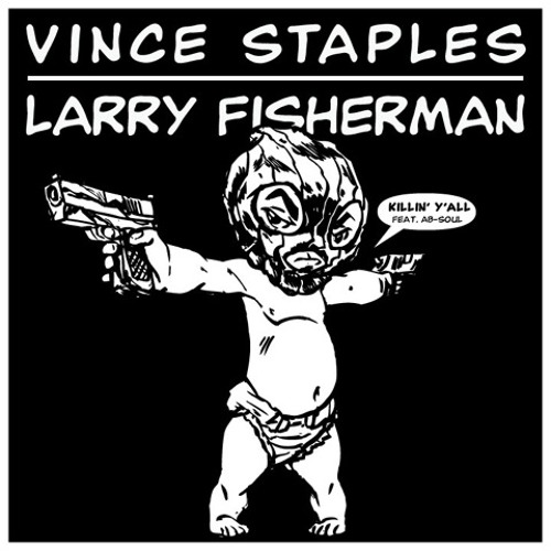
This artwork for the single 'Killin' Y'all'. Once again it has the same font as the mixtape cover for the text. It features one of the babies from the cover, with guns in each hand, relating to the name of the song and also making it clear it relates to the mixtape.
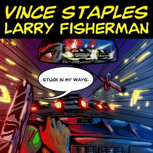
This artwork for the last single 'Stuck In My Ways' keeps up the comic theme. Once again it has the same fonts used for the artist names and speech bubbles. Overall I think this comic theme was very successful as it is unique, eye catching, and was done professionally.
...............................................................................................


This is the front and back cover for his fourth mixtape, 'Shyne Coldchain vol.2'. It is similar to the 'Winter in Prague' approach with simple design and layout that looks professional. The front cover features bandannas tied together forming a noose. It is centered, just like the title beneath it. On the back cover the song names and contributors are left justified and in black. The producers are then right justified and in a grey. This forms a hierarchy as the more important song name stands out more. Although this is very simple and features no colours, it still looks professional and stands out, with particular attention drawn to the noose which is a bit eerie and has lots of connotations.
...............................................................................................

This is the cover for his EP and latest project, named 'Hell Can Wait'. The name itself is a contradiction to a saying his mum used to tell him, "Hell's not going to wait for you to get yourself together". The cover features a house on Obispo Ave, 65th street, which is where Ramona Park is in Long Beach, a place he spent a lot of his childhood days. '6500' can be seen above the door, also relating to a song off the EP called '65 Hunnid'. The image shows a boy at the start of his pathway leading to his front door. In front of him the house is burning in flames, with a group of 6 people chilling on the front step as if nothings happening. The fire is possibly representing hell, meaning his home where he was brought up was not a good environment. I am unsure as to whether it is a child looking at him and his friends, or him as a child looking at his Dad and his friends. I presume its the latter, as the whole theme with the title and address is about him growing up. Overall I like this cover as it is bright and eye catching. The illustration looks very professional and tells a story, matching the songs on the EP.

This is the cover for his first single off the EP. Unlike his mixtape 'Stolen Youth', there is no theme throughout the singles and project cover. This cover features the song name 'Blue Suede' in a decorative, calligraphic font which is eye catching. It's on a white background, possibly to draw all attention to the the title. In the background there is a subtle grey silhouette of a pair of trainers hanging over a telephone line. This is associated with gangs marking their territory and marking drug dealer spots. It changes the context of the title, for those who haven't heard the song itself, suggesting the 'Blue Suede' is referencing his affiliation to the Long Beach Crips who show it by displaying blue.

This second single named 'Hands Up' references the problems of abusive authority on civilians in America. The person in the image has their back to us, and is holding his hands high in the air like the police order. The person is illuminated around the edges suggesting a light source in front of him. The imagery depicts someone in police headlights being told to put their hands up. The name itself also relates to the phrase 'Hands up, don't shoot' in protest to the unnecessary shootings from police. Overall the cover is simple but has a clear message that links to the song.
...............................................................................................
Vince Staples' Logo

This is Vince Staples logo, designed by John Langdon. So far, I have only seen it on the 'Blue Suede' single artwork and some show posters, so it hasn't been used very consistently. I could use this on the work I produce to form a stronger and more recognisable identity.